Crossfit Gym Logo
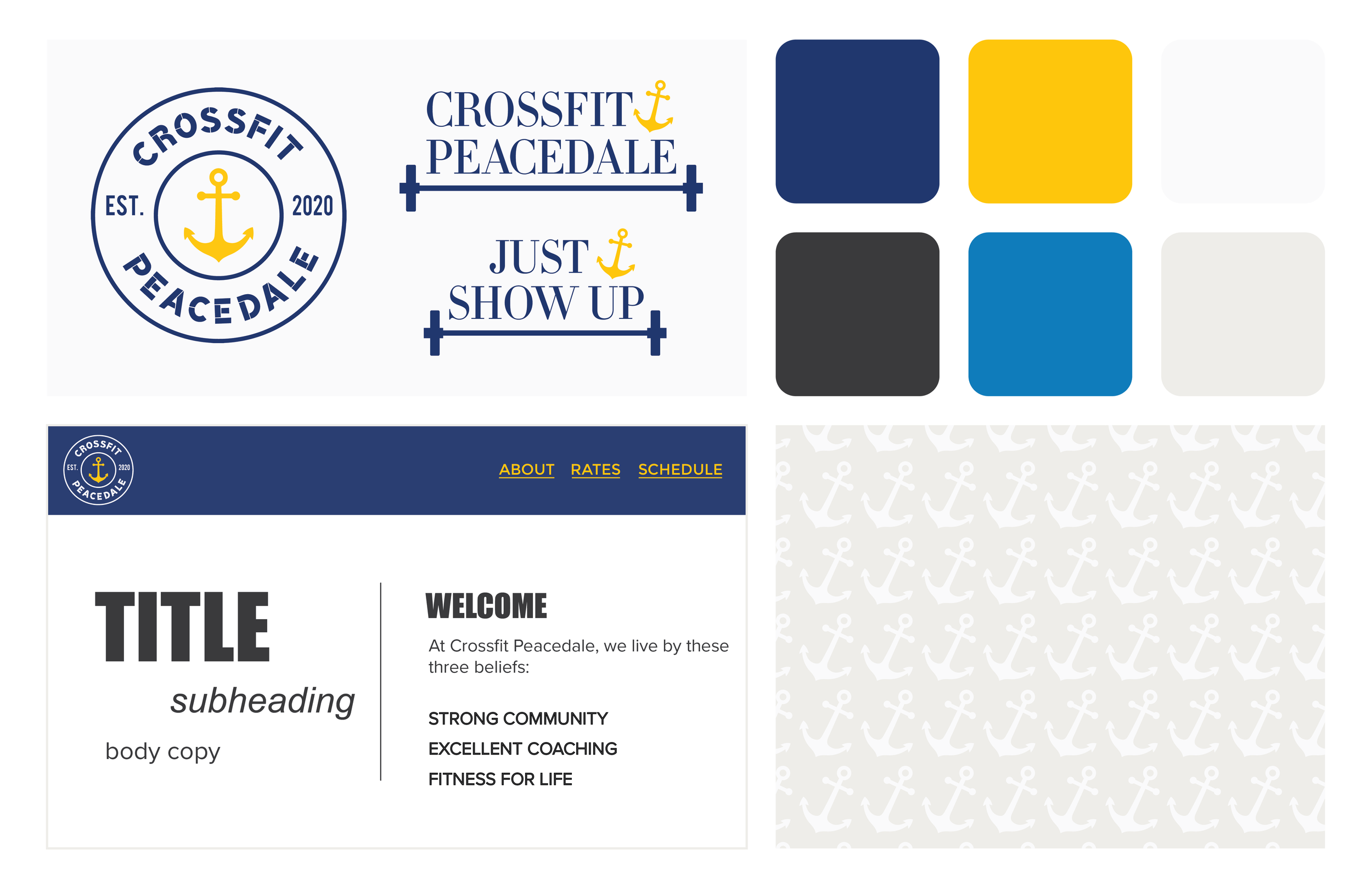
Crossfit Peacedale is a gym that was established in 2020. They asked that the logo reflect community, the beach and if the color palette could feature blue and yellow as the primary colors.
I knew up front that using a nautical/beachy icon was important to the brand as a whole since they’re located in the Ocean State — it was just a matter of picking the right symbol!
From there, I worked a lot with type. I'm happy with where we landed because even though the type is a little stylized, it’s still extremely legible.
I added the secondary logo (barbell & weights) as another option for apparel items and additional signage.
Client: Crossfit Peacedale
Services: Logo Design
Art Direction: Nicole Lufkin & Kas Arruda


