Crossfit Peacedale
Crossfit Peacedale, located in Rhode Island, is a crossfit gym that was established in 2020. They’re a gym centered around community who want to give their members the opportunity to reach their fitness goals surrounded by like-minded people. They strive for happiness and tangible results.
Overview:
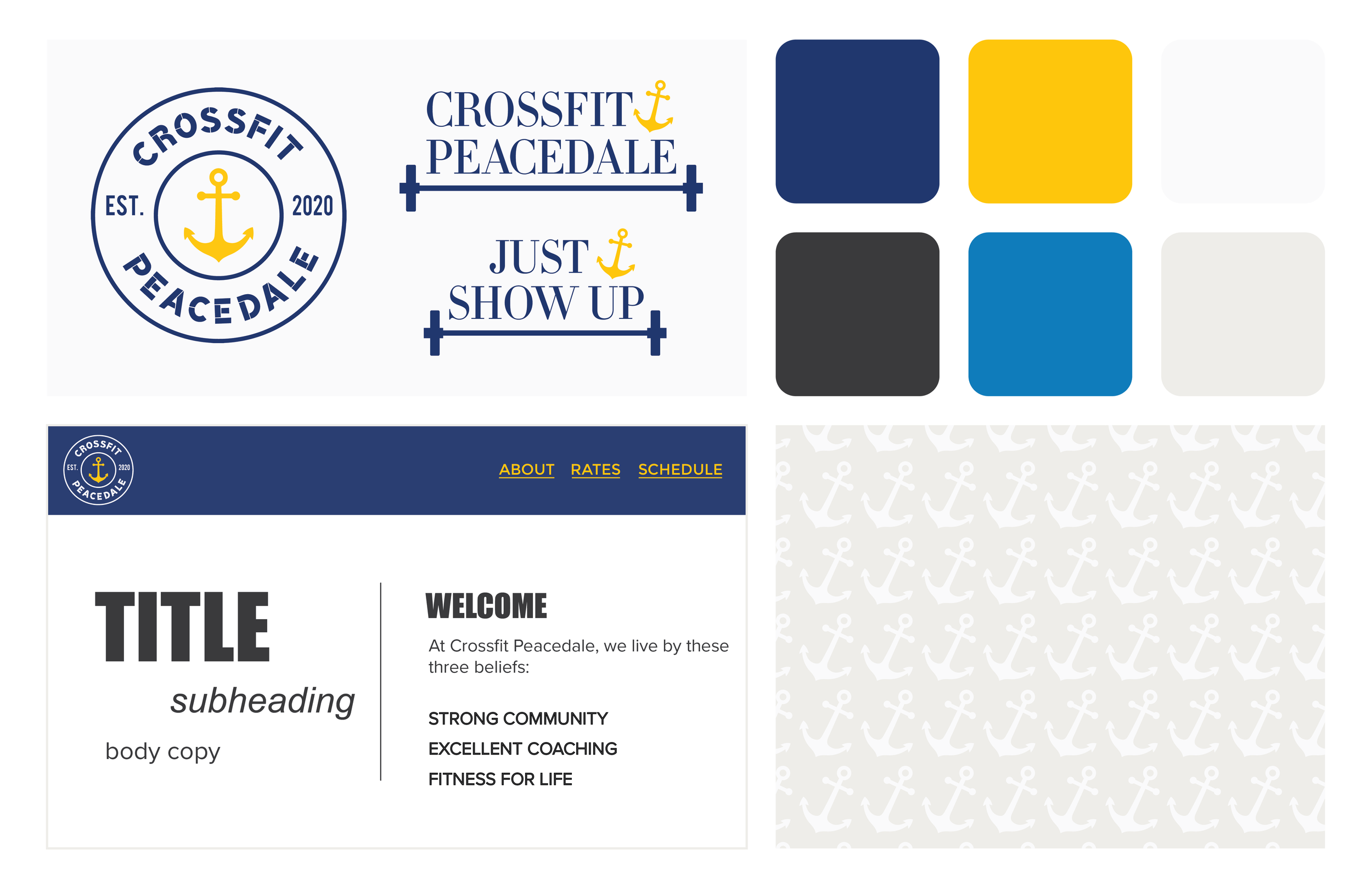
They had asked that the logo reflect community, the beach and if the color palette could include blue and yellow as the primary colors.
Deliverables:
Logo, Secondary Logo
Client
Crossfit Peacedale
Design Type
Branding
STRONG COMMUNITY
EXCELLENT COACHING
FITNESS FOR LIFE
Process:
I knew up front that using a nautical/beachy icon was important to the brand as a whole since they’re located in the Ocean State — it was just a matter of picking the right symbol! First drafts used a sun before I eventually swapped that for the anchor.
From there, I worked a lot with type. Should it have a grungy beachy feel to it? Should it be a little more serious and bold? I loved the font that was chosen in the end because it was cool, a little bit stylized and extremely legible. The font could work for both the logo and advertising.
I added the secondary logo (barbell & weights) as another option for apparel items and additional signage.


